Wednesday, December 16, 2009

A new (to me) type of hybrid: print + painted

I'm playing with a technique new to me:
  1. work on the computer with an available image, lock down subject and composition
  2. print the image on fabric
  3. paint over the print
It's analogous to middle-class pottery decoration in the 19th Century, when potteries used mass-produced decals for the primary pattern on a piece. Then, skilled artisans would 'touch' the decal with hand-painted details. The result was a product that was affordable, yet (in part) still wholly original.

I've figured a way to feed my own fabric through my injet printer by laminating the "canvas" to a carrier piece of paper. I then mount it -- right now, on foamboard, but soon, on matboard, the heavy, stiff cardboard used by frame shops.

After using a clear sealer, I then pick up my brushes and oil paints and...

... give myself some practice in brush handling and color mixing
... give customers a (kinda) original oil painting for much less than a wholly original work.

An example

Here's a screen shot of the example image, a photograph with a Creative Commons release from the photographer glasseyes on Flickr.com. I was primarily attracted to the banding of sunlight and shadow.


Note that there's a planter with ornamental grasses between the two small trees; and there is no sky showing; and there is a potentially distracting highlighted large tree canopy at the upper left.

Here's the image as printed by inkjet. Colors are subdued because I am using plain fabric -- that is, not fabric that has been prepared for inkjet printing, with brighteners and other chemical layers.


Here's a first hybrid print + painting -- this one done by a bright brush. This type of brush terminates in a straight line. Note that I've added a sky, removed the grass planter, and simplified the woodsy background.


Here's a second hybrid, this one done with a filbert, a type of brush whose termination resembles a filbert nut -- rounded and flat. Here, a completely different sky - a range of hills in the far background - much different woodsy background.


The mauve bushes in the middle distance don't work (all they do is distract the eye), nor does the stark white on the tree trunks... I'll probably paint over these bits or just toss the thing.

A little more tweaking of this technique, a little more brush practice, and I'll be listing hybrids of this sort in my Etsy shop... meanwhile, any comments?

Wednesday, December 2, 2009

When a one-on-one restaurant tour leads to a landscape oil


 6 x 4 in. (15 x 10 cm) original oil on hand-made canvas panel. Unframed. Available in my Etsy store


Next door to the Framingham, Massachusetts main post office, there's a restaurant, once a proud showcase in the IHOP chain, blue from chain smokers, a favorite stop for EMTs as the elderly clients regularly needed them. 

It then became an independent pancake house and grill, but never changed clientele. About a year ago, it closed and moved closer to dereliction -- a process that the independent management had begun by neglecting the physical plant.

Last Friday, walking back from the P.O., I went over to look in the windows. Somebody was renovating the place. Just then, a guy came out the front door -- at first I thought he was a workman, but it turned out to be the new owner. It's going to become a Mexican-Spanish restaurant.

He was exhausted, but urged me inside and began showing off his handiwork. There was nothing that he found to be usable inside that had not been adopted, re-purposed, spiffed, perfected. The solid wood wainscoting he had sanded (hundreds of feet of it) and set gleaming with new varnish in a mirror finish. 

The granite buffet top was now his desktop in a tiny office, where his original drawing for the menu cover was drying on the wall. The rotting carpt was gone, the cement underlay acid-cleaned, an array of Mexican tiles in place, awaiting imminent setting.

Out back, he pointed out a stack of wood pallets from new equipment for the kitchen - he was going to use them. For something. He didn't know what, yet. 

"Everybody here throws everything away," he said. "Where i come from, these would be anything from a couch to a porch to a house."

I asked where he was from originally. "Mexico."

Where? I asked. "Jalisco. You probably know Guadalajara - it's in Jalisco. I'm from the countryside."

The restaurant is opening next March. I went home and hit Flickr for Jalisco. One photo popped out, and it was available under Creative Commons. The photo by Wonderlane, intrigued me by its exotic colors - the river, the sky. And the exotic skyline... exotic to those of us around Boston, where skies are Canadian blue and rivers are granite-gray or sky-blue, and mountains don't shoot up vertcally and skim off their tops.


Wonderlane has a blog (much better than mine) here.

Tuesday, November 24, 2009

Experimental landscape: Sunflower fields #3


6 x 4 in. (15 x 10 cm) original oil on hand-made canvas panel. Unframed. Sold.

Ground fog was lifting in the early morning sun as the Amtrak Empire Builder rumbled its way toward our first stop, Glacier National Park, after leaving Chicago. We were in our first day of our 12-day 45th anniversary trip.


It's a scene that I'll be revisiting many times. Everyone who was awake came to the windows on the left side of the train to exclaim over the beauty.

I'm pretty sure this is my third try in oils - this time with an experiment in removing detail. It still isn't the soft band of colors that I'd like, but we're getting there. #1 was claimed by Kittie; it won't be for sale.

Excursion - Rose in the style of Clyde P. Parsons


 6 x 4 in. (15 x 10 cm) original oil on hand-made canvas panel. Unframed. Available in my Etsy store

Again, trying to loosen up, work in a painterly style.

Claude P. Parsons (1995-1972) was a California artist who published two Walter Foster art books. This is a study of a still life in his How Claude Parsons Paints Flowers, one of Walter's best efforts. Claude's great granddaughter, Erin Jones Graf is an active painter in Wyoming (see her work here) .

The oversize booklet has some excellent paintings in a style reminiscent of Edouard Manet (to paraphrase van Gogh, only a few motions of the brush, yet a capture of everything about a flower). This, in addition to incredibly useful information on how to mix colors for flower painting.

Erin writes me:
He made his money (so that he could paint full time) working with Howard Hughes in the oil industry. I think he did that for around 20 years....  He then worked for a wallpaper company designing wallpaper prints, ...[later working] with Walt Disney, painting for Pirates of the Carribean in [the Anaheim] Disneyland.  He stayed in LA and lived in Beverly Hills. After his first wife died, he married a beautiful girl named Virginia who was Greta Garbo's legs in movies (I guess Greta didn't like her own, or the producers didn't)  He died in 72 of Leukemia.
Erin writes of standing close to Parsons paintings at her home as a child:
As far back in my life that memory allows, I remember perching my eyes ever so close to his strokes so that the only thing in focus was color and texture. I would then back away and be amazed at the simple image that could transpire from such complex rhythms of paint application.
 Everyone's friend in adolescence, Holden Caulfield, talks about writers you wish you could meet, in Catcher in the Rye. Claude is an artist I wish I could have met. Few of his paintings make it to the auction market, probably because people hold on to them.

Claude's second Foster book, the improbably named Common Faults in Oil Painting, is on its way to me from a used book seller in Florida. Look for the eradication of common faults in what I do...

2 Experiments: Mount Baker from the Anacortes Ferry


6 x 4 in. (15 x 10 cm) original oil on hand-made canvas panel. Unframed. Available in my Etsy store 
 
6 x 5 in. (15 x 13 cm) original oil on hand-made canvas panel. Unframed. Available in my Etsy store

 The sun was  setting, literally in the sky and figuratively on our 45th anniversary trip to the Pacific Northwest in August, 2009. K. was writing postcards in the Washington State ferry's food court while every once in a while, I'd go out into the wind and cold to see what could be seen. We had left Sidney, BC on Vancouver Island, on our way back to the US mainland at Anacortes, Washington.

At one point, I stepped out and saw Mount Baker in the waning sun. I didn't know it was Mt. Baker until long after we got home. The air was clear enough that the snow-capped mountain looked to be a mile away, but instead, Baker was some 44 miles away.

Here are a couple of experiments. The first is a knife painting - the only brush work was the reddish glow on the snow mass, applied by brush.

The second is a brush painting - with a little knife work on the mountain's snow - another attempt to loosen up.

I'll be trying Mount Baker again, a stunning sight, as beautiful as Japan's Mt. Fuji.

Monday, November 23, 2009

Experiment: Whistleriana (Portrait of the artist's mum)


6 x 4 in. (15 x 10 cm) original oil on hand-made canvas panel. Unframed. Sold.
After running across a photo of a yellow-gold chrysanthemum in my collection, I decided to have a go at it in oils.

The experimentation is two-fold. First, I need to loosen up, so I tried for a painterly approach.

Second, I wanted to get familiar with some new tubes of water-mixable oil paint. Winter is upon us, and we have to shut the windows and doors here in the Northeast. Fumes and odor from "odorless" paint thinner are more than we can take.

Water soluble oil paints allow me to keep working with the windows shut... instead of turpentine or odorless paint thinner, I can use water both to thin the paint and to clean brushes. Great invention.

As for the title, sorry about that. These things occur to me and then it's too late.

Thursday, November 19, 2009

Experiments & Excursions... new Etsy shop section

I'm putting together a new section of my Etsy shop - Experiments & Excursions.

Behind the move is a dual need. First, I want to stretch my capabilities by trying new effects. Second, I want to loosen up while waiting for enough income from sales to get larger canvases. The small size of the paintings that I do have a tendency to make me focus on small details, when I need to work more "painterly" and free.

A couple are ready to go and I'll be listing them soon.

About shop sections
Etsy allows each seller to add virtually any number of sections. They aren't anything except a handy way to chunk up our offerings into categories that we set up.

We decide what they are; we name them. They're just pigeonholes, hopefully to make shop navigation easier.

Thursday, November 12, 2009

What to do with a useless teapot


6 x 4 in. (15 x 10 cm) original oil on hand-made canvas panel. Unframed. Available in my Etsy store

This began as a small bouquet of late-summer flowers, picked when frost was imminent. I tossed them into a teapot left over from inventory in the late 1970s, when I was a potter. Actually it was a leftover mistake - the bottom was too thin, and I never put it on sale.

I had devised a rich glaze in an oatmeal color, with painted decoration in blues, blue-grays and muted turquoise. It was a hell of a good glaze, though I'm immodest in saying so myself.

The whole thing is set in Edouard Manet style - black background, polished mahogany table.

I think I was remembering the summer sun - look at those yellows!

Three poppies and two daisies

One of the most engaging TV painting teachers is Gary Jenkins (and, when she's allowed, his with Kathwren). Gary specializes in floral painting. The Create Channel runs their series but won't re-run them. Omroep MAX, a public television channel in The Netherlands, not only runs their series when new, but cycles through ones from the recent past. And MAX puts each episode on its web site for a week, so you can watch all you want.

Out of this comes three paintings. The first is of Gary's original composition, with some additions on my part to cover up some less than great brushwork on my part:

6 x 5 in. ( 15 x 12.5 cm), original oil on hand-made canvas panel. Unframed. Available in my Etsy store .

The second was a slightly different aspect ratio, and I added a new poppy and played with the background:

6 x 4 in. (15 x 10 cm) original oil on hand-made canvas panel. Unframed. Sold.
Immodestly, this is one I like. Available in my Etsy store .

Then I had a shot at seeing the composition through the (imagined) eyes of Edouard Manet (1832-1883), who is not Claude Monet, gotta watch those vowels. Edouard was an inspiration and friend to Claude.

Here, in its mahogany and mauve glory, is the result:


(Sold)

No daisies, you say? Ed would not have painted daisies. He hated the country and daisies are country; he was a Paris boy through and through. Turning one poppy around, sort of a can-can view.

I added a Japanese fan. The fan was my grandmother's, brought back from a barely-operational Osaka by my father at the end of World War II. Dad was communications officer aboard a troop carrier that brought home thousands of soldiers as part of the Magic Carpet fleet managed by the US Navy.

One big scene and one tiny scene from Long Island

Nope, not that one. Long Island, Maine.

It's a tiny island in Casco Bay off Portland. Kittie and I opted for a mini-holiday - drove to Woburn, Massachusetts, Amtrak train ride Saturday morning from Woburn to Portland, Maine - ferry from Portland to Long Island - and a great weekend stay at The Chestnut Hill Inn.Travel in reverse via the same means was on Sunday afternoon.

Since it was weeks past Labor Day - the end of the season - tourists were gone from Long Island. We brought in our own food (told our hostess, Carol Doughty, that we'd be bringing a chicken and an axe with us on the train.) Carol gave us the run of her restaurant kitchen, the restaurant being closed, and provided some great muffins and coffee the next morning.

We walked the half mile south to South Beach (no diets involved in this one), a huge expanse of granite sand. An empty expanse. We explored until nearly dark and the landscape below is one souvenir.

The wind was blowing fiercely, the temperature in the 40s, the water (strangely) almost calm. Record high tides the night before kept us from the foremost tourist attraction (beyond beauty) of the beach, the singing sands. They were too wet to sing (apparently the sand squeaks underfoot as you walk).

Cool colors, cool weather, cool scene.

Then with the light fading, we made our way back up the gravel road to the inn. Looking down, I saw an incredible play of color and pattern in the crushed granite - can anyone guess what underlies the island? - littered with fall leaves.

 
Both paintings are 6 x 4 in. (15 x 10 cm) original oil on hand-made canvas panel. Unframed. Available in my Etsy store .
 
The weekend was filled with friendly folks. A Long Islander driving up from the ferry saw us trundling toward the inn, dragging our roller suitcases behind us. He didn't have room for us, but he could take our suitcases to the inn. We then had a liesurely walk past permanent homes and neat little summer cabins.

His sister-in-law, it turns out, was a guest at the inn, and she took Kittie for a long stroll to meet several islanders as I trekked around solo to make photos of bits and pieces of the island.

Everything jibed. Amtrak's conductor was a hoot. The restaurant waitress on Saturday was fun, even if she didn't let me have the apple pancakes (we were too late for breakfast). People on the ferry - two stops at smaller islands before the mile-long Long Island - were (a) friendly or (b) fun to watch or (c) both. Our hostess at the inn was delightful.

Rain, which had been forecast to stream down in record amounts for both Saturday and Sunday, held off until Sunday afternoon as we were (after shopping in downtown) 25 steps from the Portland Holiday Inn. There the concierge called us a taxi to get to the train home. The taxi driver gave us a life tale that was full, but punctuated with depth. Matter-of-factly, he told us of the loss to cancer of his girl friend, about his many drives from Portland to Woburn, 100 miles each way, where the Lahey Clinic did what they could and then wrote off most of the charges because the doctor hated it that she had gone.

Highs, lows, friendly people, good food, human depth, human warmth - decompression at its best.

A couple of orchids

I've carried forward the concept of orchid portraits drawn against a backdrop of their (original) natural habitat. I have two new ones.

Both are 6 x 4 in. (15 x 10 cm) original oil on hand-made canvas panel. Unframed. .

The first is a Miltoniopsis roezlii; behind it, Brazilian cliffs. Available in my Etsy store

The second is a Bifrenaria harrisoniae, nestled in a Panamanian valley. Sold.


Since the time in October that I painted these, I've been to my first orchid show, the Massachusetts Orchid Society show at the Tower Hill Botanical Garden. There, I came to realize two things.

First, orchids are three dimensional. They are hugely three dimensional... something not clear in photographs or in the small range of orchids at Home Depot and Stop and Shop. I have a lot of work to do, a lot of things to learn, if I want to fully depict this dimensionality.

Second, orchids are overwhelming in every respect - color, shape, plant habit and (for those with fragrance), their perfume.

Many at the show asked me if I were going to grow orchids. I mostly said, "I don't think so." Early this summer, I planted onion sets. A couple of weeks into October, I harvested onions that were smaller than the sets. Orchids wouldn't stand a chance against me.

Wednesday, October 14, 2009

Kancamagus Highway - birthday gift


8 x 10 in. (20 x 25 cm) oil on canvas panel.

Once, a while back, Kittie and I drove the Kancamagus Highway in New Hampshire, about 26 miles of spectacular views of the White Mountains. Since we were there at leaf-peeping time, I mostly got to see the rear bumper of the RV ahead of us. This is one of the rare views, which I painted for Kittie for her birthday, so, not available for sale.

Sunday, October 11, 2009

A stop in Whitefish and the addition of a private car


Our Amtrak Empire Builder passenger train stopped just at deep sunset in Whitefish, Montana. It's a tiny town, but well known in the northwest (at least in the past) for its posh resorts and ski lodges.

It was one of the longer stops along the Empire Builder route, allowing train personnel to top up fuel and replenish food and goodies. Passengers can debark and stretch their legs. I didn't really need it - we had boarded at East Glacier (National Park) less than forty minutes earlier. But I didn't want to miss the chance to see us on the outside. Again. I hopped off the train at all of our longer stops.

So I wandered out onto the platform of the late Victorian (and beautifully maintained) train station. I didn't see it come up, but an old. wooden passenger car was being shuttled off a siding and staged behind our train by a switch engine. The car was ornate, old, gleaming in the lamplight. A party was in full swing, visible through the large glass windows. The music could be heard, rock-and-roll.

An Amtrak worker on the platform of the old car stood waiting for coupling of the car, so I asked him what this was.

"Private car," he said. It turns out that Amtrak will attach private cars to its scheduled runs, for a hefty fee.

"Look incredible," I said.

"It should," he said. "It was the private car of [here he inserted the name of a fabulous party-animal industrial tycoon of the late 1800s]. Crystal chandeliers, mahogany interior, even has a complete master bedroom suite with private bath and shower."

I didn't write down the name of the tycoon on my trip notes - I've been racking my brains and it may come back to me... but it may, and in fact probably, will not.

I took the photo which is the basis for my oil above, then watched as a switcher gently connected the old car. The 21st century rock-and-roll audible outside it was a strange, anachronistic touch.

As it turns out, the photo was not of the scene above. The Empire Builder swept straight off to the left. But the picture was so dark that a printout made the dark shapes of one-story shops along a street masquerade as our train. It looked as though our cars curved around to the right, pointing into the wall of mountains north of town. Only after I painted the little canvas did I revisit the photo and discover my mistake. Mistakes can make far more interesting pictures than reality...

Monday, October 5, 2009

A Flurry of Still Lifes and a Floral or Two

A smattering of small paintings and (for me) a big one... at 8 x 10....

Beach Rose + Mini Landscape
6 x 4 in. (15 x 10 cm) original oil on hand-made canvas panel. Unframed. Available in my Etsy store
Wild beach roses are fascinating. They're all over the east coast, along beaches and dunes, bringing color and fragrance to the seaside.

The Web doesn't reveal their origin - or more precisely, my search skills didn't turn it up. The rose burst forth first in the Orient, Wikipedia assures me. It made it to England well in time for the War of the Roses, probably because finicky roses allowed a landed aristocrat to crow, "My gardener is better than your gardener."

But the beach rose is a blue-collar rose. It doesn't require coddling or attention. It grows anywhere, even (as here) in sand, beaten by salt wind and scoured by winter storm.

Did ours escape from colonial gardens? Did rose hips find their way into cargos from the Orient, back when Massachusetts blue-blood money was piling up, thanks to the 18-19th Century tea, porcelain and opium trades?

The little landcape here is of the beach-rose-lined walk that heads past Clarke Pond to Gray Beach, part of the Coolidge Reservation in Magnolia (okay, Manchester) Massachusetts. Only the outline of the foundation is left of the once-fabulous Coolidge mansion overlooking Massachusetts Bay - Boston is visible, and so is Cape Cod on a clear day.

Off Gray Beach is Kettle Island. Artistic license allows me to bring it a lot closer to make a sort of interesting background.

It's a great place to gaze at the Bay, and at the fabulous coastal homes in the area. And to ponder why the marble Georgian-style mansion existed for less than 50 years, built and later razed by the modestly-named Thomas Jefferson Coolidge. No, I dont know if he was related to President Calvin. Silent Cal, he was called. T.J. is silent as well, having passed away in the 1960s.

Bedding Dahlia Study
4 x 6 in. (10 x 15 cm) original oil on hand-made canvas panel. Available in my Etsy store

I'm planning to capture summer on canvas, as Fall grows on us in the Northeast. This is a quick study of a couple of our bedding dahlias, caught on a sunny day. Even at 6 x 4, they are painted larger than life size here... bedding dahlias are a grand, enthusiastic if tiny celebration of form and color.

Still Life with Gardenia

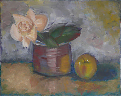
8 x 1o in. (20 x 26 cm) Painterly still life on commercial canvas panel. Available in my Etsy store

I'll be building my skills for years to come, if the time is allowed me. I'm happy with this one, which is sort of impressionistic, and it's a lot larger than most of my oeuvre.

The vase is a jar from my days as a professional potter in the 1970s. Its form is a cross between 19th C. American stoneware canning jars and Egyptian alabaster forms, both strong, expressive geometries.

By the way, in my future still lives, you'll see this jar in varying proportions - here, I've made it low, chubby jar. In real life, it's stocky, but a lot taller.

The glaze is the rich shiny red-brown of Albany slip, no longer mined; raw iron oxide dabbed on the pot under the slip blooms into a beautiful deep iron red in spots. The apple is a Gala, and its red bloom plays endlessly with bright yellow areas.

In the painting's background, I've played a little with complementary colors. If anyone cares, it's a tip of the hat to the improbably named Merlin Enabnit, who authored two very quirky books on color for Walter T. Foster.

(I like to tell people that I've studied extensively under Walter T. Foster. He produced hundreds of $1 how-to-paint books from the 1940s through the 70s - and his publishing house is continuing to offer low-cost painting manuals. Some of Walter's original line is quite good; some of them are just shovel jobs, many just galleries of examples of Walter's personal art collection or borrowings from earlier publications, without much redeeming pedagogic content.)

Still Life - Ginger Jar, Apples and Dahlia
6 x 4 in. (15 x 10 cm) original oil on hand-made canvas panel. Sold.

A little still life with another of my pots from my stint as a potter, 1969-1981 or so. The pot is this a white (actually oatmeal) glazed vase in the classic shape of a small Chinese ginger jar. On it is a leaf pattern in a soft cobalt blue, a mix of cobalt oxide, manganese carbonate and black iron oxide - and based on the natural cobalt ores of China, wih all the "impurities" that make it so much richer than the brash, blaring blue of pure cobalt oxide.

Michael Cardew, a great man and a British crafts potter from early-mid 20th C. described the role of the hands in wheel-thrown pottery. The right hand is controlling. Without it, the volume of the pot would disappear; the wall would simply slump. But the left hand, the one inside the pot, is the one that will confer life to the shape. A final, often whisper-gentle pass with the left hand alone will belly out the shape. This ginger jar benefited from Cardew's touch, with its gently outcurved sides.

Lying on the mahogany is an orange dahlia, which is about to find a home in the jar.

I took a shot at a Dutch-ish dark background. You likely wouldn't have a wall this color. But it's a nice gray.


Still Life - Apples and Stoneware Bowl

6 x 4 in. (15 x 10 cm) original oil on hand-made canvas panel. Available in my Etsy store

A Gala and a Honeycrisp apple cluster around a little stoneware bowl with only "USA 5 in." molded into the bottom. The rim is clear of the gorgeous blue glase, so these would have been stacked rim-to-rim, then foot-to-foot, then rim-to-rim and so on, many feet high in the giant high-fire kilns of (probably) an Ohio stoneware factory anywhere between 1920 and 1950.

The relatively tiny diameter would make it ideal for tucking in and around bigger pieces. They served to increase the density of wares in the kiln. You don't want open areas in a high-fire kiln, because there's a huge fuel economy gained when at white heat, the pots radiate heat to each other. They have to be fairly close together for that to happen.

I kind of like the polished mahagony table in this setting, a rich offsetting color for the apples who are basking (complementarily speaking) in the blue of the bowl.

Still Life - Mum in Glass Vase

6 x 4 in. (15 x 10 cm) original oil on hand-made canvas panel. Available in my Etsy store


I've just discovered Eduoard Manet, who is not - to the bane of all beginning art history students - Claude Monet (but without Manet, no Monet). Manet, with an "a", did incredible still lifes toward the end of his too-short life.

Ed copied Old Masters when he was starting out. Now he's the old master, and I'm trying to copy him. My effort is a little crude, but charming. To me, at least.

Under the vase, a white silk handkerchief with an openwork pattern, part of a collection from my wife's aunt. Aunt Tish never went a day dressed in anything other than crisp, classic and gorgeous high-fashion clothes, pointed up with carefully selected accessories. This is one of the latter.

Two Mini-panoramas from last summer's anniversary trip

Another hiatus - and another update.

I make my own canvas panels from watercolor paper, acid-free glue and extra-fine 100% canvas in a miniature weave, AKA white bedsheet. Left over from each watercolor sheet is a strip 1 x 12 inches, and I've begun to turn these into 1 x 6 in. mini-panoramas.

The first - sunrise over the Columbia river.

1 x 6 in. mini panorama, oil on canvas board. Available in my Etsy Shop

I wake early, even on vacation, so I left our Amtrak Empire Building bedroom and made my way up to the observation car. I sat down next to a teenager. The sun was just giving a little color to the summer sky.

"You're up early," I said. Yep, he said. "And you're going where?" I and my sister are riding to Pasco. "Washington?" Yep.

He and his sister had taken the eastbound Empire Builder the week before, hopping off at Cut Bank, Montana, where their mother met them and drove them back to Helena, where she lived with her new husband. I miss her, he said. After a pause, he said, There's nothing to do in Helena. I was bored out of my mind.

"How old are you?" Fourteen. "Ah," I said. "At fourteen, boring is easy. At my age, nothing is boring. There is nothing you get to know enough about. There's always something new to dig into."

She makes the best peanut butter sandwiches, he said. I thought to myself that there is nothing to a peanut butter sandwich - what can you possibly mean? A year later it came to me: his mother made it. It was something in his life that he would now have only once in a while, and only after many hours by train and car.

The sun was now up and the train, having skittered catty-corner down from Spokane to Pasco, slowed to a stop. My new friend got up, woke up her sister who was sleeping across three observation car seats, and they left, saying goodbye.

The train pulled out again, following the Columbia river, wheeling directly east when the river did. The sunrise was magnificent.

Sunrise in Crofton

1 x 6 in. mini panorama. Available in my Etsy Shop

Later in our trip, having rented a car in Portland and visiting old friends who had moved from the Boston area, we stayed on Vancouver Island at a bed-and-breakfast in Crofton, British Columbia. The little town overlooked Saltspring Island, where, it turned out, there was a quirky but excellent little seafood restaurant. An hourly ferry took us less than a mile across Vesuvius Bay and we lucked into a seat. It was August 17th, our 45th anniversary, and the meal apparently was meant to be: we walked in just as someone on the phone group was canceling their reservation.

Our seat on the outdoor balcony overlooked the bay and the weather was perfect. At the table next to us (one table closer to the bay) was a couple celebrating their first anniversary. Next to us was a couple celebrating their one week anniversary. We all enjoyed the coincidences, even the people dining on down the balcony. A perfect evening.

The mini panorama is on the Crofton side, and the little bridge is part of the tiny town's Shore Walk.

Thursday, August 20, 2009

Some new ones - mostly florals

Some new ones...


Experiment with a genre used now and again by Gary Jenkins - floral with landscape vignette. In this case, the vignette is another scene of North Dakota sunflower fields taken from the train window on our 45th anniversary trip. 6" x 4" (sold)


The flooded quarry at Halibut Point State Park, Rockport, Massachusetts. The single red tree growing precariously in cracks in the quarry wall caught my attention. 6" x 4". Available in my Etsy Shop


An incredible gladiolus from our garden, a random survivor from last year... and from a random assortment. 4" x 6". Available; contact me for for more information.


Another random survival gladiolus, doubly incredible. I spent nearly two hours mixing purples until I achieved 0ne close to the original. 4" x 6" Available; contact me for more inforatmoin


Our glads and a hydrangea on a fence line graciously installed by our neighbors. 6" x 4" (Not available)


Sunday, August 16, 2009

Long hiatus and a new direction

Busy as could be, for months... I've taken a new direction, dabbling in oils, and will be posting new paintings here. Meanwhile, here are a few:


Perfect beach day, northern Michigan (6" x 4") Available in my Etsy Shop


Two rose of sharon (6" x 4"). Available in my Etsy Shop


Sunflower fields in morning mist - taken from the window of our train last summer on a memorable 45th wedding anniversary trip... by train from Chicago to Glacier National Park via Amtrak's Empire Builder, then on to Portland and finally up to Vancouver Island B.C.
(6" x 4"). (Not available... Kittie wanted this... she loved the colors of the sunflower fields.)


Red daylily and bud, abstract background (sold). (6" x 4")

At the moment, I put selected ones on eBay for a little more than the cost of materials. (Trying to keep the hobby self-supporting).

Wednesday, February 11, 2009

Small free collection of Art Deco Papers: Birthday gift from me to you


Download the 5.4 MB paper pack here.

Contents:
Papers, all 12 x 12 at 200 dpi. They'll print just fine a 300 dpi.

They are variations on two basic designs

Based on a colophon,a stylized daylily in a circle, resting on a stylized stem with a flower bud on each end
  • Slate blue with creamy orange motif
  • Navy blue with blue and orange motif
  • Black with blue and orange motif
  • Black with white motif
  • Gray with slate blue and orange motif
  • Gray with navy blue and dark orange motif
  • Gray with light slate blue and orange motif
Based on a circle motif on the title page for "The Firefly Who Scattered Sparks":
  • Cream with orange and blue motif
  • Slate blue with yellow and orange motif
  • Purple with dark blue and dark orange motif
From the last freebie fast forward 30 years
We're fast-forwarding 25 years from our last freebie, moving in time from the Arts & Crafts movement in 1900 to Art Deco in 1925, with it love of geometry and color.

This paper pack uses artwork in a children's book published by The Volland Company in the 1925. The illustrations are by VE Elizabeth Cadie.

I wish I knew more about Ms. Cadie. There is almost nothing on the Web about her except exclamations over her lively Deco illustrations. It's unclear whether her name was Ve or whether this is a V. E. Elizabeth Cadie. The two motifs in these papers come from details. One is a colophon, the other a title page in The Cat Whose Whiskers Slipped by Ruth Campbell... and I cannot find anything about Mrs. Campbell.

Her stories are delightful.

Volland is well-represented on the net, primarily because it was the Joliet, Illinois (Chicago) publishing house for Jonny Gruelle and his Raggedy Ann and Andy series.
Art Deco
Ah - it's too complex. See the Wikipedia entry for Art Deco and the article about its birth place and time, the 1925 Exposition Internationale des Art Decoratifs et Industriels Modernes. The style partakes of all sorts of attributes: Art Nouveau, Cubism, Modernism, and plenty more.

Downloading and installing the SMB format
You can download it (5.4 MB) here. The file is an .SMB for Scrapbook Max and SBM automatically installs it.

To use the file, when your Web browser asks you what you want to do with the file, click the "Open" button (Internet Explorer or Opera browsers) or choose "Open with: Scrapbook MAX!" and click OK (Firefox browser). Once the file has downloaded, you should see a message that tells you that the template has been successfully installed. It will now be available the next time that you create a new project or page.
Don't have Scrapbook Max?
For those of you without Scrapbook Max: the file is really a ZIP file. You download it, change the file extension to .ZIP and use any ZIP utility to retrieve each of the JPEGs and PNGs. But you should get Scrapbook Max...
Styles
Foster + McKeehan types

clean lines
graphic
eclectic
hip & trendy
classic

Monday, February 9, 2009

Free Arts & Crafts Minikit for Scrapbook Max


Download the 9.4 MB minikit here

IMPORTANT NOTE: these are all collected as Embellishments. This means that you will NOT find the kit if you start a New Scrapbook and try to find it from on the "Select a Theme" dialog.

Here's how you find them
You start a new scrapbook (or open an existing one), and once you it's open , you click on the heart icon or Object > Embellishment, and you will find the folder named DJGArtsCraftsMinikit.

It's the first of a planned set of products I'm calling the 1900 Series.

What's included in the SBM files
This mini-kit's based on some British, American and Canadian Arts & Crafts designs.

It includes:
  • 2 papers based on wallpaper designs from architect Charles (C.F.A.) Voysey, clean and straight from the factory
  • 2 duplicates, but grungey
  • 1 ribbon, neatly pressed in Arts & Crafts / Art Deco style
  • 1 ribbon duplicate in the form of an engraving
  • 1 ribbon shadow PNG -- you can make the ribbon appear to float inches above the page!
  • 1 enamel button that picks up the rose motif of one of the papers
  • 1 wood, bronze and mother-of-pearl, Arts & Crafts style photo frame
  • 4 photo corners (UL, UR, LL, LR) based on Arts & Crafts silver pin.

The 1900 Series
The 1900 Series will include decorative styles that were well in place in that year. More accurately, it includes styles floating in the air from the mid-1800s through 1920 (and which continued at least on through to Danish Modern in the 50s and 60s).

These include:
  • Art Nouveau / Jugendstil (France; Germany)
  • Arts & Crafts (England, Canada & US)
  • De Stijl (Netherlands)
  • Vienna Succession (Austria)
  • (later) Bauhaus, Art Deco, and more
  • (in the auction world) Late Victorian, Edwardian

It just so happens that these styles (and it's often hard to tell them apart, to be honest) are major favorites of mine... and of millions of other people.

About the Arts & Crafts Movement
Arts & Crafts began as a social movement in the mid-19th C. It sought to bring beauty to the common person. It contrasted well-designed hand-made goods, beautiful to the eye and beautiful in use, with cheap, kitschy machine-made stuff.

John Ruskin and others (including Arts & Crafts genius William Morris) felt that the designs embodied in mass-produced goods were aesthetically bad, and that bad aesthetics coarsened and demoralized daily life.

Arts and Crafts turned to nature and to Medieval English inspiration to avoid square corners -- angles other than 90 degrees were OK -- and decoration for decoration's sake. Everything was to flow from history or nature, and every detail was supposed to contribute a cohesive sense of beauty.

In painting, the approach was played out in the Pre-Raphaelite movement, symbolized by the willowy, yearning work of Edward Burne-Jones -- not coincidentally, a close friend and collaborator of William Morris.

In this kit, the abstract rose blossom in one of the papers is based on Medieval models (the Tudor Rose in particular, though the color scheme in the latter join the white rose of York with the red rose of Lancaster).

Note on the process
All the designs are based on originals. I produced them using vector art techniques in Real Draw Pro from Mediachance and Xara Xtreme from Xara Inc. I spend around 50 hours total in research before beginning.

The ribbon is a scan of an actual ribbon -- took about an hour to select the ribbon, iron it, scan it and extract it. The rose paper was done in less than two hours; the floral pattern took 10 hours and it's still not 100%. The button borrowed elements from an earlier pin and took about an hour only because I had done the earlier pin wrong. The frame took under an hour. The photo corners took many hours, far too long, and involved preliminary work in Asymetrix Web3D, a 3D modeling program.

Downloading and installing the SMB format
You can download it (9.4 MB) here . The file is an .SMB for Scrapbook Max and SBM automatically installs it.

To use the file, when your Web browser asks you what you want to do with the file, click the "Open" button (Internet Explorer or Opera browsers) or choose "Open with: Scrapbook MAX!" and click OK (Firefox browser). Once the file has downloaded, you should see a message that tells you that the template has been successfully installed. It will now be available the next time that you create a new project or page.

Don't have Scrapbook Max?
For those of you without Scrapbook Max: the file is really a ZIP file. You download it, change the file extension to .ZIP and use any ZIP utility to retrieve each of the JPEGs and PNGs. But you should get Scrapbook Max...

Styles
Foster + McKeehan types (see this post)

graphic
eclectic
hip & trendy
classic
shabby (Old World, romantic)

Friday, January 30, 2009

Freebie: I have a heart after all

DJG_Valentine Frame... Suggested Serving (above)

A while ago, on the Scrapbook Max forums, I said I wouldn't be doing any Valentine-y kinds of things.

Then I ran across a neat card design and decided to 'improve' it... or at least take my own swipe at the idea - a frame around a cluster of hearts. It's in the Suggested Serving above, at the bottom right.

But with built-in extras
Then I decided I could pull out each of the hearts and the frame alone. These could then become embellishments... see above, upper left, and lower left.

Upper left is a photo of Kittie and me on our 45th Anniversary trip that included stops in Montana, Oregon, Washington state and Vancouver Island. This is us in front of Multnomah Falls, Columbia River Gap area, Oregon.

On the lower left, I've simply rotated the frame-plus-hearts and added a few more hearts, spilling them over into the background.

SMB format
You can download it (2.1 MB) here . The file is an .SMB for Scrapbook Max.

Now for those of you without Scrapbook Max: the file is really a ZIP file. You download it, change the file extension to .ZIP and use any ZIP utility to retrieve each of the PNGs.

Styles
Foster + McKeehan types (see this post)
  • eclectic
  • hip & trendy
  • anything goes

Style-ish book worth getting

A long time ago (some time before 322 BC) Aristotle wrote his Poetics.

Wait! Wait! Don't stop reading, even though I'm delving into dead Greeks....

In Poetics, you see a fine, fine mind carefully noting the playwriting practices of his day. Aristotle categorizes the conventions of his day and makes some incredibly astute observations on how plot lines develop.

Since then, directly or indirectly, Poetics has helped millions understand works of fiction... all because a bright guy could make sense of a welter of contemporary practics.

It turns out that the Greek plays observed by Aristotle express the more or less universal need to pursue a pattern of living through experiences, thoughts and emotions to reach some sort of resolution or conclusion.

Same Same for Scrapbooks
On a smaller scale and around a much more circumscribed universe, Kitty Foster and Wendy McKeehan did a similarly fine job of categorization of the welter of scrapbook approaches and types that are floating around us.

Their book is Find Your Groove, A Guide to Discovering Your Scrapbook Style (ISBN-10: 1599630060; ISBN-13: 978-1599630069).

The book presents 7 basic styles:
  • clean lines
  • graphic
  • eclectic
  • classic
  • shabby or Old World
  • hip & trendy
  • anything goes.
There is an eighth, journalistic, which is more an approach than a visual style, and can partake of any of the previous graphic styles.

The whole tome is a veritable graphics arts and design course in miniature, and it's really helpful if (like me) you know what you like but you don't know where to begin assembling layouts.

You can get this book used (or even new) at very low prices, and you should. And that's even though there's a bit of confusion around the differences between classic and shabby/Old World.

I like it so much that I'm going to reference Foster + McKeehan styles in any scrapbook kits or embellishments I produce... the first a random collection of Valentines goodies that together fit several styles: eclectic, hip & trendy, and anything goes.

The collection should be my next post.

Sunday, January 25, 2009

Scrapbooking... polymer clay...a blog at 66

Here's where it all starts. First blog. At age 66.

And here's how I got here:

A while ago
I (or, rather, we, Kittie and I) made a living with stoneware clay. With the effort, I bought a house, a car, then supported two kids.

We did OK, but burnout finally got me some time in 1979. Experimental glazes failed and I didn't have the trouble-shooting skills to determine what was going wrong. My standard glazes became boring.

I noticed more and more how hard it was to drag 50-and 80-lb bags of clay and minerals down into my basement shop. It was ever harder carrying 20- or 35- or 50-pound ware boards up the back stairs to my kiln. It became harder and harder to keep concentration during the 18 to 24 hours to fire the wares. You get the picture. I burned out.

From there it was freelance writing... a strange group it was, but then I'm strange, so it worked out, for a while... then corporate life, then magazine life (the most satisfying and engaging of my careers), then high-tech startup (back to strange), then advertising agency life (where I finally took a graduate degree, a veritable PhD, in strange workplaces), then... back to freelance writing.

Freelancing never boring

No, it wasn't anything you're likely to know about, unless you are deep into manufacturing, plastics production and formulation, and a few other arcane subjects. But it is never boring.

The need for graphics in magazine articles and brochures led me to acrete various graphics programs. I passed on the biggies (Adobe Photoshop, Illustrator) unless a client would cover the cost of the software and opted for 2nd tier offerings (Corel PhotoPaint) and free.

With a sort of background in design and handwork from clay, and a fair grasp of graphics program operation, I idly played around in off moments. But nothing really gelled.

After discovering polymer clay (a mere 70 years or so after its invention in the 1930s), I began playing with it. I thought I could just carry over my mineral clay experience, and still take advantage of the color and capabilities of polymer clay, but I've never progressed past the for-personal-use stage. Probably won't. Doesn't matter.

In which our blogger discovers scrapbooking

Then I discovered scrapbooking because my daughter Jennifer had done some outstanding books. She uses real paper and real objects and puts together real albums.

From there, I discovered digital scrapbooking... a perfect use for all the skills I developed dabbling in graphics software. No harm to trees. No big bucks for punches and tools and papers and embellishments.

Ways to assemble digital scrapbooks were all over my computers. Adobe InDesign, Serif PagePlus, Microsoft Publisher, Mediachance Real Draw Pro, even PowerPoint and Word. But they had drawbacks, one or another.

Then, in 2007, Scrapbook Max (http://www.scrapbookmax.com) somehow came into my purview, and I downloaded and tried it.

I'll have more to say about Max on other days. It does some very sophisticated stuff with minimal hassle.

Anyway, bottom line, here we are.

We'll be producing some embellishments, papers, shapes and kits over the next little while. There will be a store sooner rather than later (still deciding between etsy and eCrater).

History, grungy, nostalgic-romantic

I've decided on a style, more history than cute, more grunge than daylight, more nostalgic-romantic than edgy.

Watch for freebies

Freebies will be available through this blog -- and now and again on the Embellishments forum in the Scrapbook Max community site.

Anyway, welcome to my world.